📊Dashboard Model With Corporate Data for CIOs📊
Would you benefit from having a high-level, centralized view of your organization’s health and financial performance?
Most organizations still struggle with messy data and disjointed data sources. In turn, they fail to optimize their data strategy and miss out on important insights
As a helpful mitigant, here is a ready-to-use Key Performance Indicator Dashboard!
The tool tracks the following organizational metrics:
✅Earnings Before Interest and Taxes (EBIT)
✅FTEs
✅Expenditures by department
✅Control issues
✅Sales growth versus profit
✅Other key indicators across HR, projects, operations & finance
Customize this tool to your organization through simple data entry following the clear formatting and logically laid out tabs
You’ll be able to track high-level organizational metrics on a real-time basis and in a centralized place. Sequentially, it’ll help you double-down on your successes or course-correct your impending failures
Want access to the full file?
Leave a comment below and I’ll send you the access link ASAP!👇💬
Germain UX – Improve Sales Processes and UX in Real-Time
#Performance #Customerexperience #Automation
Credit to Marcus Small
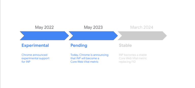
Web Performance Metrics: Why INP Is Your Most Practical UX Performance KPI
Interaction to Next Paint (INP) is the Core Web Vital that measures real interface responsiveness. Learn why it is the most practical UX performance KPI.