Ever clicked around a website, got frustrated, and just left? Yeah, so have 88% of users. Once they have a bad experience, they don’t come back. (Google)
Friction is the thing that ruins smooth experiences. It makes people abandon carts, close apps, and shake their heads at slow-loading pages. And the worst part? Most businesses don’t even realize it’s happening.
Let’s talk about what UX friction really is, how to spot it, and—most importantly—how to fix it.
The Three Types of UX Friction
Friction isn’t just a slow-loading page or a clunky menu. It shows up in different ways:
⚡ Emotional Friction – When Users Feel Stuck
This is the gut feeling of hesitation, frustration, or doubt.
Example: A user wants to sign up, but the pricing page feels sketchy—no clear refund policy, too much fine print.
Fix: Be transparent. Show pricing clearly, offer guarantees, and add real testimonials.
🧠 Cognitive Friction – When Users Have to Work Too Hard
If people have to think too much to use your product, they’re out.
Example: A confusing checkout flow where users don’t know what’s next.
Fix: Keep it simple. Use clear labels, make the next step obvious, and remove unnecessary fields.
🎮 Interaction Friction – When the Product Physically Slows Users Down
This is when clunky design or unnecessary steps get in the way.
Example: A form asks for a password twice. Why? No one likes retyping.
Fix: Cut the fluff. Use smart defaults, autofill, and let users get things done faster.
How to Remove Friction (Without Breaking UX)
Think of UX friction as different layers. Here’s how to tackle each one:
1️⃣ Usability – Remove the Obvious Roadblocks
This is basic stuff: users should get from A to B without confusion.
Example: Dropbox made sign-ups faster and saw more conversions.
Fix: Look at your forms. Shorter, simpler ones = more people completing them.
2️⃣ Liquidity – Make Actions Flow Smoothly
The less effort users need to take, the better.
Example: Amazon’s one-click purchase makes it ridiculously easy to buy something.
Fix: Count how many clicks it takes to complete a key action. More than three? It’s time to simplify.
3️⃣ Lucidity – Make Everything Instantly Clear
Users don’t want to guess what a button does.
Example: Stripe’s API docs are clear, easy to read, and help developers get started fast.
Fix: Ditch the jargon. Use simple words, clear labels, and design with clarity in mind.
4️⃣ Authenticity – Build Trust (So Users Stick Around)
Friction isn’t just about design—it’s about trust. If people don’t feel comfortable, they won’t engage.
Example: Airbnb made home rentals feel personal and safe, which helped build a huge market.
Fix: Show real reviews, use friendly language, and don’t overcomplicate things.
How to Spot UX Friction in Your Product (and Fix It Fast)
Want to clean up friction in your UX? Here’s what to do:
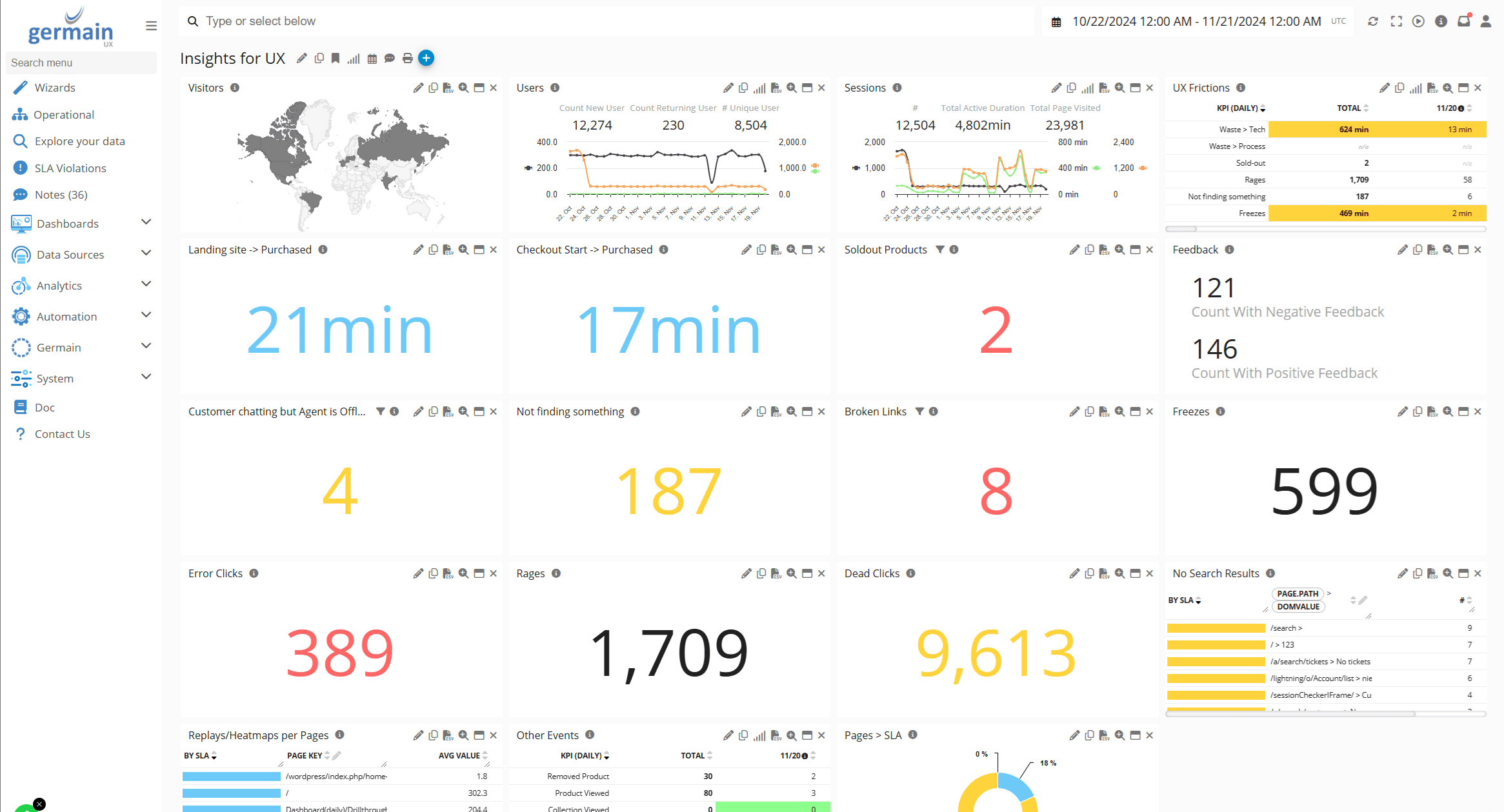
✅ Watch real users – Use session replays to see where people get stuck.
✅ Check frustration signals – Look for rage clicks, abandoned forms, and drop-offs.
✅ Run quick usability tests – Ask a few users to complete a task and note where they struggle.
✅ Use feedback loops – Read customer support messages and surveys to catch common complaints.
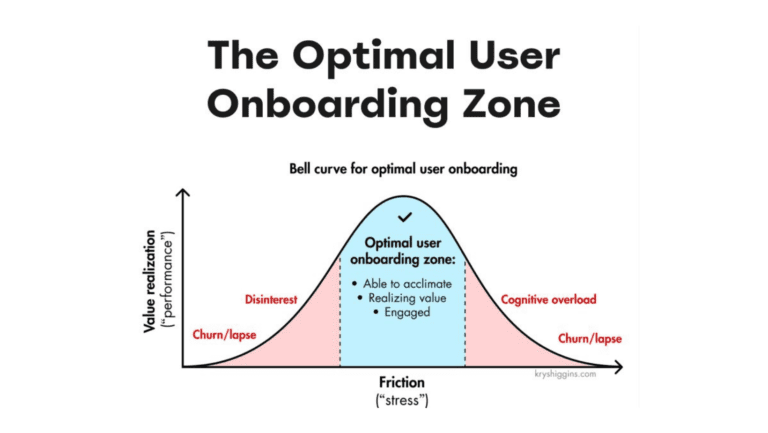
Why Some Friction is Actually a Good Thing
Not all friction is bad. Sometimes, you need a little friction to make UX better:
✅ Prevent mistakes – Confirmation dialogs stop users from deleting important files.
✅ Encourage engagement – A little challenge (like gamification) keeps users interested.
✅ Force careful decisions – A well-placed delay can help users double-check before making big moves.
👉 The goal isn’t to eliminate friction completely—it’s to use it wisely.
Final Thought: UX Friction is a Business Problem, Not Just a Design One
Bad UX doesn’t just annoy users—it kills sales, retention, and growth. The best products aren’t just pretty; they work seamlessly because the right friction is removed, and the right kind of friction is designed with intention.