If you’ve ever worked on a digital product—or just used one—you’ve probably heard this advice a million times: reduce friction. Make things fast. Make them seamless. Remove anything that slows users down.
That’s solid advice.
No one wants to fill out a form with 20 fields just to sign up for an app.
Nobody enjoys a checkout process that feels like solving a puzzle.
But here’s the thing: sometimes friction is actually a good thing.
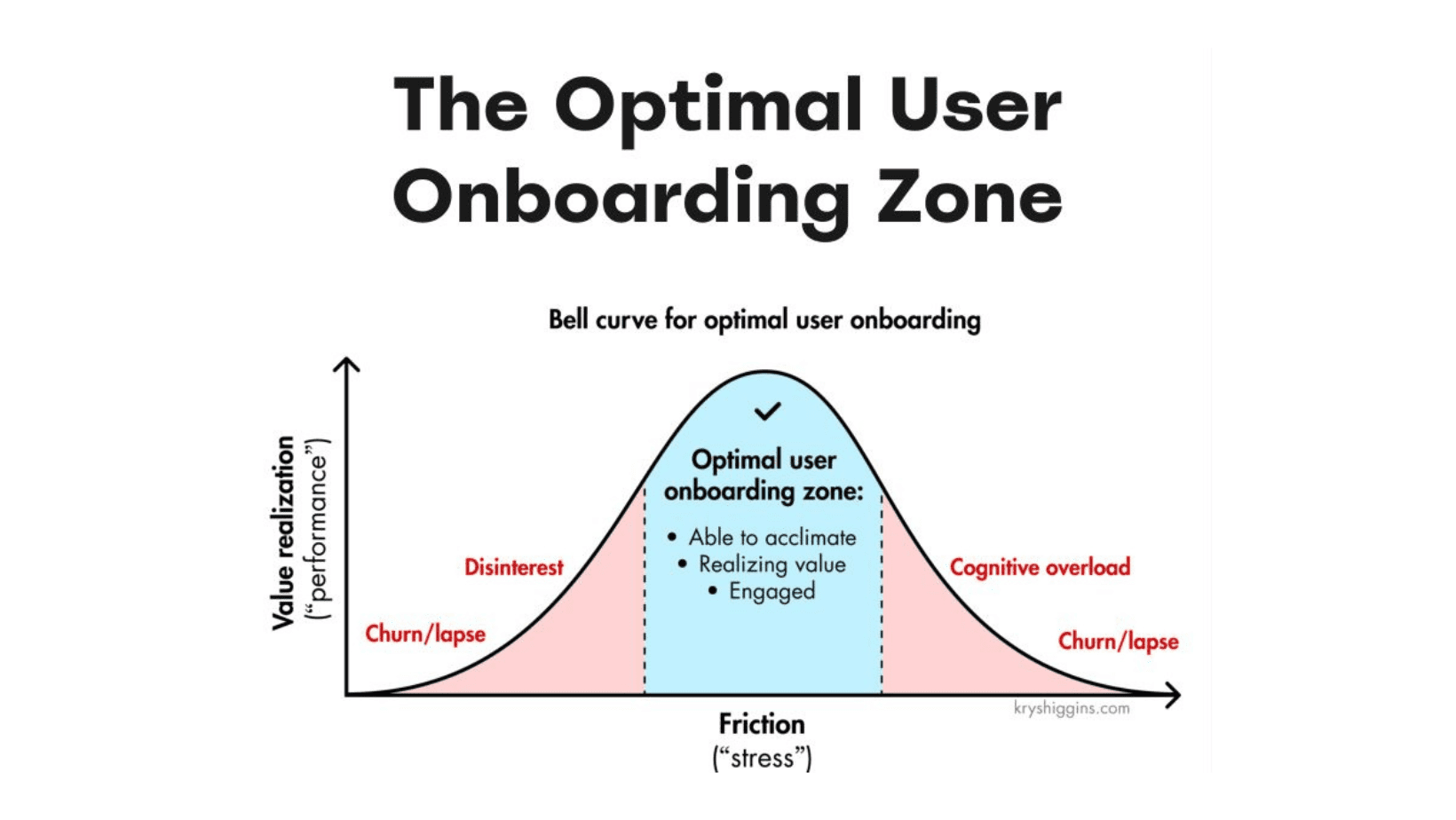
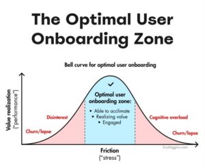
In fact, in the right places, it can make a product better, safer, and even more enjoyable to use. The trick is knowing when friction is just in the way… and when it’s actually helping.
When Friction Is Just Plain Bad
Before we get into good friction, let’s talk about the kind we all hate.
Bad friction is the stuff that slows you down for no reason.
- A slow-loading website that makes you wait.
- A checkout flow with too many unnecessary steps.
- A mobile app that buries the main feature under five layers of menus.
The best apps—like Amazon, Apple Pay, or Duolingo—are great because they remove this kind of friction. You open the app, do what you need to do, and move on with your life. No headaches. No unnecessary effort.
But should everything be effortless?
When Friction is Actually Useful
1. Security: Protect Users Without Annoying Them
Good friction: Two-factor authentication (2FA), biometric login.
Bad friction: Requiring users to reset their password every month.
Security is one of the biggest areas where friction can be helpful. Nobody likes 2FA, but they like getting hacked even less.
UX tips:
 Offer biometric login (Face ID, fingerprint) to make security smoother. Let users stay logged in on trusted devices. Reduce password complexity requirements—but encourage passphrases.
2. Preventing Mistakes: Give Users a Second Chance
Good friction: “Undo” options for actions like deleting files or sending emails.
Bad friction: Extra confirmation steps for every action.
Google Docs autosaves every few seconds—so even if you accidentally close a tab, your work isn’t lost. Gmail gives you a 5-second window to unsend an email. These small delays prevent headaches.
UX tips:
Use confirmation modals only for high-stakes actions (e.g., deleting an account). Offer an “Undo” option instead of forcing extra confirmation steps. Use progressive disclosure—hide advanced options until they’re needed.
3. Helping Users Learn: The Right Kind of Challenge
Good friction: Repetition in language-learning apps like Duolingo.
Bad friction: Confusing tutorials that don’t match real-world use.
Duolingo intentionally makes you repeat words and sentences—it’s how you remember them. But if an app forces users to go through a long, mandatory tutorial for something simple, that’s just frustrating.
UX tips:
Use progressive onboarding—teach users as they go, rather than overwhelming them upfront. Let users skip tutorials if they’re experienced. Use gamification to make repetition feel rewarding.
4. Preventing Accidental Actions: Stop Users from Hurting Themselves
Good friction: “Are you sure you want to delete this?” prompts.
Bad friction: Unnecessary “Are you sure?” messages for small actions.
No one wants to accidentally delete all their emails or make a $500 purchase by mistake. A well-placed confirmation prompt can prevent disaster.
But if every action asks “Are you sure?” it slows users down too much.
UX tips:
Use timeouts (e.g., a short delay before deleting important files). Offer recovery options instead of making users confirm every action. Use smart defaults (e.g., autosaving changes instead of forcing users to manually save).
So, How Do You Get Friction Right?
Instead of just trying to remove all friction, ask:
- Does this friction protect the user? (Security, preventing mistakes)
- Does this friction make the user stop and think in a good way? (Ethical decision-making)
- Does this friction improve learning or skill-building? (Education, onboarding)
- Is this friction just making things harder for no reason? (If yes, get rid of it.)
Practical UX Takeaways:
- Audit your user flows – Are there any unnecessary steps? Remove them.
- Test friction intentionally – Ask, Is this step helping or just getting in the way?
- Consider letting users choose their experience – Some want guidance, others just want to get things done. Give them the option.
The best user experiences aren’t just about making everything instant and effortless. They’re about using friction wisely.
So next time you’re designing a product—or just using one—ask yourself:
 Is this friction getting in my way… or is it actually helping me?