Guide Conversions with Choice Architecture in UX Design

Is your website driving users to convert, or are they bouncing away without taking action?
Choice Architecture, a powerful concept rooted in behavioral economics, helps guide user decisions by subtly influencing their behavior through design.
When applied effectively, it can significantly boost conversions and optimize user journeys.
Why Choice Architecture Matters in UX
In UX design, the environment where users make decisions can impact how they interact with your product or service. The aim is not to limit choices but to present them in a way that encourages users to make the best decisions for their needs—and your business.
Just as physical stores place high-margin products at eye level, UX design can guide users towards desired actions using design elements such as prompts, notifications, and default settings.
Example: Imagine a checkout page where the default shipping option is free but slower. Users are more likely to stick with the default, even though faster options are available, simply because it’s the default.
How to Use Choice Architecture to Guide Conversions
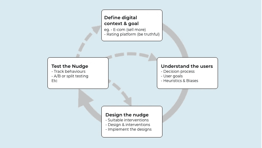
Use the Digital Nudge Cycle to strategically influence user decisions.
Step 1: Define the Digital Context and Goals
Understand the environment in which your users make decisions. This involves identifying the main goals you want to achieve, such as increasing newsletter sign-ups or product purchases.
Example: A retail site might want users to add more items to their cart. A simple nudge like “Only 2 left in stock” or “Free shipping on orders over $50” can encourage action.
Step 2: Understand User Behavior
Learn how your users think and make decisions. Recognize that cognitive biases, such as the status quo bias (where users tend to stick to the default option), will influence their behavior. Use these biases to your advantage when designing nudges.
Step 3: Design the Nudge
Create design elements that nudge users toward your goals. This could be as simple as highlighting the most popular product or adding a progress bar during checkout.
Example: Amazon frequently uses urgency nudges like “Deal ends in 2 hours” to push users toward a quick purchase.
Step 4: Test and Refine
Measure how well your nudges are working. Use A/B testing to compare different designs and gather feedback to see how users respond to your changes.
Example: Test different versions of your CTA buttons to see which colors, wording, or placement drive the most clicks.
Monitoring and Improving Nudges with GermainUX
To ensure that your digital nudges are driving the right behaviors, it’s crucial to monitor how users interact with them in real-time. With Session Replay, you can watch exactly how users navigate through your digital interface, identify where frictions occur, and see why some nudges may not be as effective.
GermainUX’s pixel-perfect, millisecond-precise session recordings allow you to analyze user behavior at scale.
Rather than sifting through endless videos, you can quickly pinpoint insights from millions of sessions, helping you understand which UX frictions affect most users.
Learn more about our user session video recording and replay and how to quickly find, at once, insights across millions of sessions!
Conclusion
Choice Architecture can dramatically improve your conversion rates by guiding users toward better decisions through thoughtful design. By understanding user behavior and using the Digital Nudge Cycle, you can create a seamless user experience that drives action without overwhelming users.
Ready to start nudging? Apply these principles to your UX projects and watch your conversions soar.


