Make it smooth. Reduce friction. Keep users moving.
That’s solid advice.
No one enjoys filling out a form with 10 unnecessary fields or dealing with a checkout process that feels like a maze.
But you can’t fix friction if you don’t know where it’s happening.
Big companies like Amazon, Netflix, and Airbnb don’t just guess where users are struggling. They track the right UX metrics, run experiments, and fine-tune their products constantly.
That’s what keeps users engaged… and keeps the business growing.
So how do you spot hidden friction before it costs you users?
Here’s how top companies do it (and how you can too).
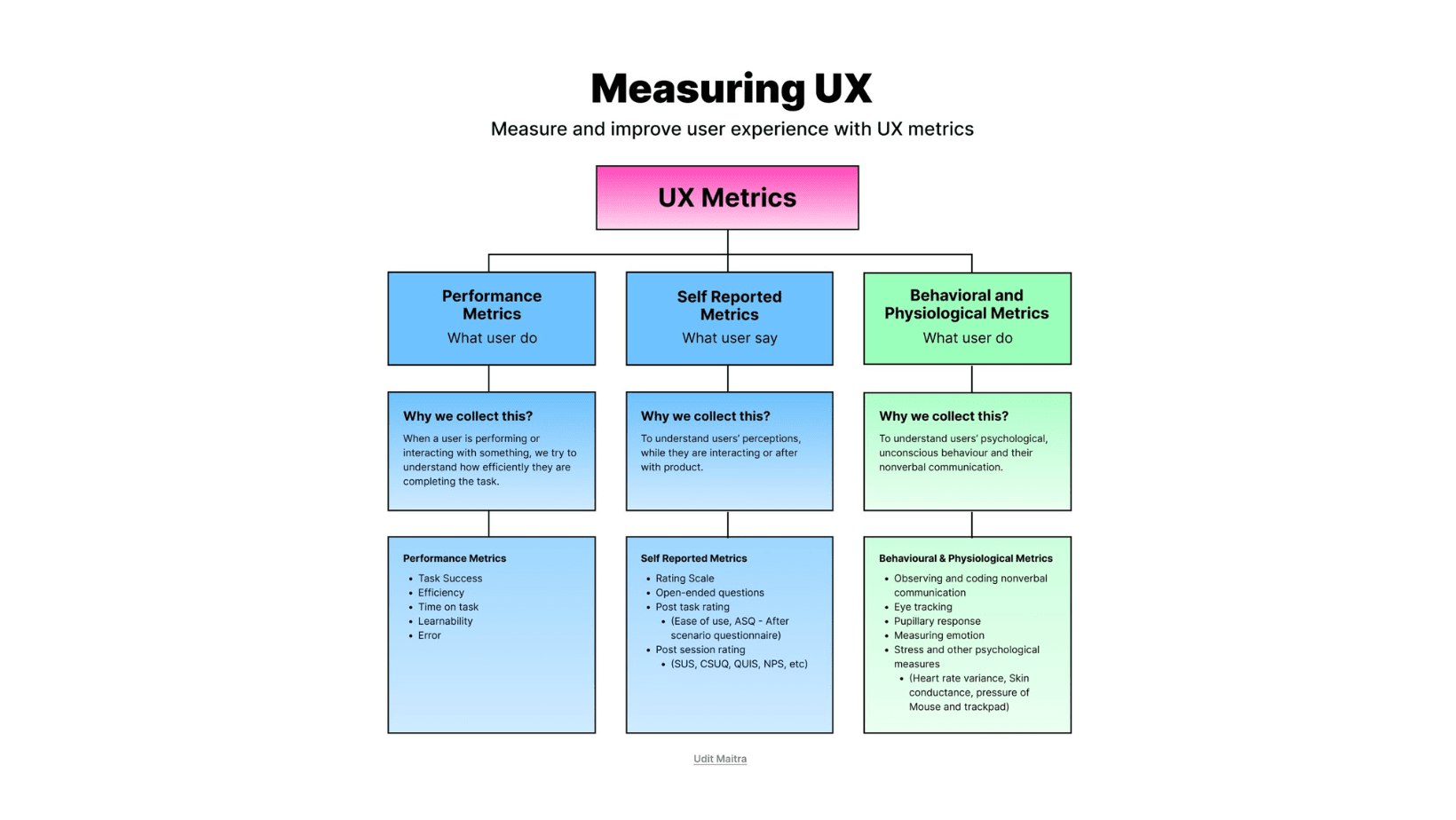
Performance Metrics (Where Are Users Struggling?)
Friction often shows up in the form of abandoned actions.
Users start something… and then give up.
Netflix found that if users didn’t add something to their watchlist within their first session, they were more likely to churn. That insight led them to nudge users toward curating a list right away.
 Key metrics to track:
- Task completion rate – What percentage of users actually finish key actions?
- Drop-off points in multi-step flows – Where exactly are users bailing?
- Time on task – Are they taking longer than expected to complete simple actions?
 UX tips:
If you see drop-offs in your onboarding flow, try breaking it into smaller, optional steps instead of forcing users through everything at once.
Behavioral & Physiological Metrics (What’s Happening Beneath the Surface?)
Not all friction causes immediate drop-off.
Sometimes, users push through—but you can still see signs of struggle.
Google measures micro-interactions down to milliseconds. If search results feel slow or animations aren’t smooth, they tweak them.
Key metrics to track:
- Rage clicks – Are users clicking repeatedly on something unresponsive?
- U-turns – Do they start a process, then immediately backtrack?
- Cursor hesitation – Are they hovering too long before clicking (a sign they’re confused)?
UX tips:
Use session recordings (Hotjar, FullStory) to replay how users interact with tricky areas. You’ll spot frustration you wouldn’t catch in analytics alone.
Technology Glitches (Is It the App… or the User?)
Not all friction is caused by bad design—sometimes the technology itself is the problem.
A button might not register clicks, a field might not save data, or an API call might silently fail in the background. The user just sees… nothing happening.
And when they don’t know why something isn’t working, they often blame themselves—or worse, leave.
That’s where platforms like GermainUX come in. GermainUX doesn’t just track user behavior—it ties that behavior to underlying technical issues in real time.
Key glitches to detect:
- Failed API calls – Is a backend service down during checkout or login?
- JavaScript errors – Are scripts breaking key functionality without alerting the user.
- Rendering delays – Is a button or section invisible because it failed to load?
- Out-of-stock errors – Are users clicking on unavailable products that seem purchasable?
UX tips:
- Use real-time monitoring tools like GermainUX to correlate UX drop-offs with backend or frontend failures.
- Don’t wait for users to report a bug—automate detection and alerts so you know before they do.
- Prioritize fixing tech issues that block high-value user actions (like submitting a form or placing an order).
When you understand both the user’s intent and the system’s response (or lack of it), you’re one step closer to reducing invisible friction that analytics alone won’t catch.
Self-Reported Metrics (What Do Users Think?)
Numbers are great, but they won’t tell you why users struggle.
Sometimes, the best insights come straight from the source.
Uber constantly surveys drivers and riders to improve the experience. One key insight? Drivers wanted more earnings transparency, so Uber redesigned how payouts were displayed in real-time.
Key feedback methods:
- Post-task ratings – Ask, “Was this easy?” right after key actions.
- User sentiment analysis – Look at common pain points in open-ended feedback.
- In-context NPS – Instead of just asking “Would you recommend us?” measure satisfaction after specific interactions.
UX tips:
Instead of generic surveys, use the Kano model:
- Ask users how they’d feel if a feature were missing.
- Ask how they’d feel if it were improved. This helps separate true pain points from minor annoyances.
Test, Fix, and Repeat
Once you know where the friction is, it’s time to fix it.
The best UX teams don’t rely on gut instinct—they run tests and track results.
Facebook runs thousands of A/B tests daily. When they launched reactions (

 ), they tested different designs and placements to minimize friction.
Key methods:
- A/B testing – Compare two versions of a feature to see which performs better.
- Incremental changes – Instead of a full redesign, tweak labels, layouts, or button placements.
- Progressive rollouts – Release updates to small user groups before rolling them out widely.
UX tips:
If users are dropping off at checkout, test small copy changes first. Switching from “Submit” to “Complete My Order” can sometimes boost conversions without touching the UI.
How to Make Sure You’re Tracking the Right Things
Not all UX metrics are useful. If you want to find friction before it becomes a problem, ask yourself:
 Are users completing the key actions? (If not, where do they drop off?) Are they struggling but still pushing through? (Look for rage clicks, U-turns.) Are they telling you something is frustrating? (Read feedback, track NPS.) Are small UX fixes making a real difference? (Test before you redesign.)
Start tracking the right UX metrics, and you’ll know exactly where to focus your efforts