Do you want to give your visitors excellent navigation so they can land on their desired page correctly? Easy navigation around a website is of the up-most importance when it comes to website performance. In this guide we will share a detailed guide for you to make organized website navigations on your site.
→ Identify Frictions at scale (Process flow analysis, event correlation, automatic diagnosis, etc).No CC, 5 Minutes Setup
We know how it feels when some of your website pages get a lot of visitors, while some important ones do not get so many. Especially when the disappointment of a raised bounce rate on your site is unmatchable. Then your visitors might be suffering from poor navigation.
So, let’s get to know all about website navigation (and how to improve it).
Why Is Navigation Important on A Website?
A website navigation bar is a list of links that helps visitors land on their desired page instantly. They quickly direct the visitor to a specific place without them getting lost in the network of different pages.
The website navigation also helps a search engine crawl and index every page without any difficulty. As all links are accessible from a menu, a search engine will index the whole site and show it to the user.
If the search engine can’t crawl something through its link, it can never index it. So, an ordered navigation design is essential for better SEO. Quicker the search engine can index the searched page of a website, more the chances of it ranking higher.
How Navigation Affects User Experience
A well-organized and effectively linked web navigation casts a massive effect on user experience. When a visitor gets to his desired page in just a couple of clicks, he stays on the web page for a longer period. Then there is also a greater chance of greater user retention.
You can analyze your users’ experience using the Germain AMP platform. Germain UX has been in the market since 2014. And since then we have been supporting more than 115,000 users with 100% user retention.
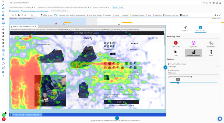
You can enhance user experience with real-time monitoring and replays. Top-down visualization allows you to identify the UX frictions that cost your organization the most i.e @ scale, then you can dive into it and either view live what the user is doing, or replay what a user did. It will help you understand whether the frictions are functional (user behavior-related) or technological and if it is the later, It helps you to point out the shortcomings of your site and you can easily clear out their navigation problems and identify the root-cause of a poorly functioning technology.
The search engines count the time a user spends on a site. If they spend more time, it means the site has a great UX. So, a search engine ranks the website higher based on the user journey and time spent on time. For excellent user navigation, you must have zero navigation errors and zero behavioral-related frictions.
Types Of Website Navigation
There are many ways to implement menus on your website. Businesses have creative and interesting website navigation bars that give a fantastic experience. But all revolve around a few common types. They consist of the following or derivatives of the following types:
1. Global Website Navigation

Source: Trajectory
Global navigation is the most used menu type in the world. It consists of a simple header with main pages that are fixed no matter which page you visit. You can also implement it as a sidebar menu.
It displays the main pages on top, but visitors have to open the main page every time for the inner pages. This type is suitable for small or newly created websites, so that visitors can easily access any webpage from the main link.
Global navigation has site navigation best practices as it is easy to locate. So, the visitor knows where to find it and land on the desired page in 2-3 clicks. Most people widely use this type for a minimal website navigation design.
2. Hierarchical Website Navigation


Source: The New York Times
Hierarchical website navigation is a type where the header menus change according to the page. When a user browses an inside page, the menu shows the links to subpages from that main page.
Hierarchical navigations are usually seen on news websites or big ecommerce stores. They are helpful when the site owner gets limited space for linking a large range of pages.
3. Footer Website Navigation

Source: Agente
Footer navigation is found almost in all CMS-derived websites. In this type, the internal pages’ links are available at the bottom of the page. The footer also contains links to privacy policies, copyrights, sitemaps, or social media.
The footer navigations are suitable for small websites, because there is a confined area. So, a small number of links work well. Some websites also link to app stores here for their applications, if they have any.
It also helps the visitor to navigate through long pages like lengthy articles. If the page doesn’t have a “Go to Top” button, it’s a hefty task to scroll right up to the top to open the menu. It is easy for them to click the desired page soon as they have scrolled to the end.
4. Local Website Navigation

Source: Philips
Local website navigation is an improved version of global navigations. In this type, the user knows where he is, like a location blimp on a map. It is located on the side therefore, the menu is always accessible.
In this type, not only the currently opened page is highlighted to show where the visitor is. But also, the neighboring pages are shown to jump to them quickly.
This type is suitable for medium-sized websites as all the links are visible in a side panel. Every main category and sub link is visible, so it creates a long list of links that indicates where you are and what is next?
10 Great Website Navigation Examples
Here are the ten best navigation menu examples from different sites. These are listed so you get some creative website navigation ideas to make impressive website navigations.
1. The Good Burger


Source: The Good Burger
The Good Burger is a restaurant website. Its menu is available in the top right corner in the form of a tasty burger. When a visitor opens it, five links are shown to them. The fascinating thing is the menu has vivid animations which provide a smooth experience.
2. Petersham Nurseries

Source: Petersham Nurseries
Petersham Nurseries is a gardening site. It has a sleek horizontal menu with a green theme to indicate nature. It shows internal pages links in a dropdown menu when a visitor hovers a mouse pointer over them. This website has one of the best simple website navigations.
3. ETQ

Source: ETQ
ETQ is a shoe ecommerce store with an elegant layout. It also has a dropdown menu that has three main page links. The whole website has a minimal and simple design with a white theme to soothe the eyes.
4. Dataveyes

Source: Dataveyes
Dataveyes is a data site that offers visualizations. When a visitor clicks on a link to an internal page, it opens the page with a side panel of additional navigation. The whole design of the menu is unique and innovative.
5. Adriatic Luxury Hotels


Source: Adriatic Luxury Hotels
Adriatic Luxury Hotels offers booking in premium hotels with luxurious services. The website has a thin bar of two horizontal menus. One navigates through different pages of the website, while the other has a list of different hotels.
6. NKI

Source: NKI Studios
NKI studios is a 2D/3D animation website in France. Its menu is the best parallax and hierarchical navigation example. Since there is no button to open the menu bar, visitors scroll down to view the big picture and scroll up to open a page. It is a mesmerizing website to experience.
7. WE3

Source: WE3
WE3 is a site where new designers and developers interact and collaborate. For website navigation best practices, it has two pages that interchange with smooth swipe animations. Other links are also just one click away at a single spot.
8. Fairchild


Source: Fairchild
Fairchild is a real estate website that has a menu in the sidebar. When a visitor clicks on the three rows, it opens a smooth panel of internal links through which a visitor can easily navigate.
9. Politico


Source: Politico
Politico is a political news website. It has a huge dropdown menu. When a visitor clicks on the menu button, it opens different sets of categories of various pages. Overall, it gives good access to all the internal links.
10. Australian Ballet


Source: Australian Ballet
Australian Ballet is a website of a famous ballet company. When the visitor clicks on the menu button, it opens the menu from both sides, like sliding doors. It gives a smooth animation and a fantastic experience.
Website Navigation Best Practices and Tips
For navigation bar best practices, strategize and organize the layout of your website. Make proper categories of different related sets of pages. So that the visitor and the search engine can easily distinguish between different pages.
Make it easily accessible for visitors for optimum user experience. Google now takes UX as a ranking factor.
For interesting navigation patterns, web should have a prominent location for the menu.
Make a proper structure for primary, secondary, and tertiary navigation.
Try to make it mobile-friendly. It will help the website to rank higher on search engines. And, it will also help the user to access your website from mobile phones.
Add a search box for the best website navigation. Visitors will be able to pinpoint their desired section.
How To Find How Your Audience Is Navigating Your Website?
The one way to identify how your audience is navigating your site is by connecting the site to Google Analytics. It is a free tool from Google and is helping millions of site owners to analyze and track their audience.
It will show you which page your visitor lands on? Whether he moves to another page or not? You know it through page visits data. So you can pay attention to help people navigate to your less visited pages. Besides page navigation, Google Analytics will also show other valuable information about your website traffic.
Another more accurate way in improving your website navigation is using Germain UX. It can monitor the clicks of your user and track where they jump to. It gives complete insight of user behaviour and visitor data. You can download Germain UX ‘s mobile app, and remain updated anytime.
Conclusion
Implementing a suitable website navigation into your site is crucial to give your visitors a brilliant user experience. If they can navigate through your site with ease, then they will retain and stay longer. It will also help in search engine rankings.
We have shown you different types of website navigations so you can decide which navigation menu will work best for you. We also have given you some examples to get some ideas and some valuable tips for best practices. So, give your audience the best menus and navigation on your site.


